Work / Graphic
McQuaig's Rebranding
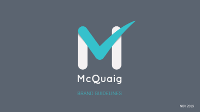
Had an initiative to modernize McQuaig's logo and brand identity. Initially a personal project to refresh the outdated 'M' checkmark logo, the new design adopted softer, rounded shapes for a more contemporary look. One key decision was to swap the primary and secondary colors, maintaining color harmony while infusing a fresh vibe. This change was well-received, providing a modernized brand identity that still felt familiar. The rebranding effort, though not initially requested, received unanimous approval, presenting McQuaig with an updated and appealing brand image. +
McQuaig's Banner
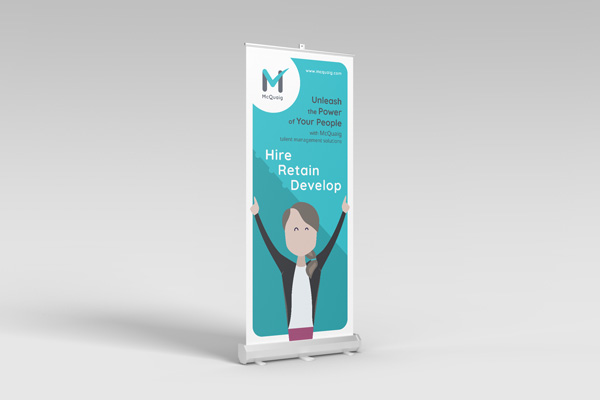
Designed a vertical event banner for conferences and fairs, featuring McQuaig's slogan 'Hire, Retain, Develop.' The banner portrays a joyful HR professional, symbolizing the efficiency of McQuaig's hiring process and its positive impact. +
McQuaig's Trifold Folder
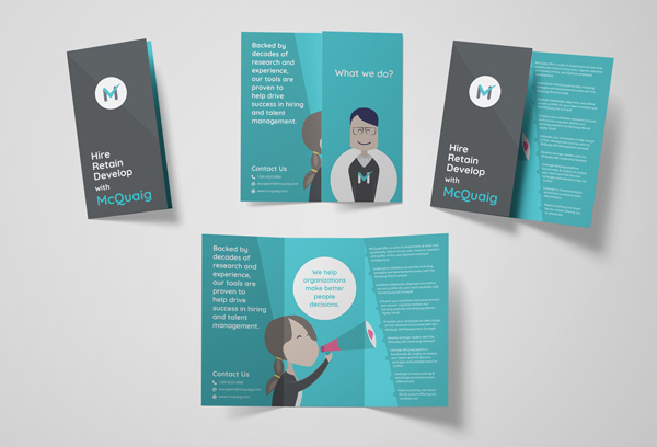
Designed a three-page folder for conferences and fairs, highlighting McQuaig's slogan: 'Hire, Retain, Develop.' The brochure begins with the compelling slogan, followed by the questions, "What do we do?" and the answer, "We help organizations make better people decisions." This is complemented by a detailed section with bullet points elaborating on McQuaig's offerings and explaining how their tools enhance the hiring process. +
McQuaig's Illustrations
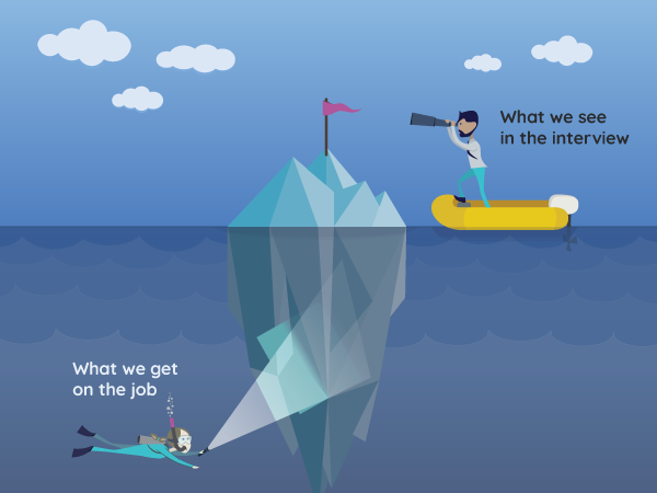
They are a work in progress, they illustrate diverse hiring process scenarios. These illustrations now serve a wide array of purposes, from profile assessments to animating videos or marketing materials for LinkedIn. They've become a fundamental visual component, deeply ingrained across McQuaig's communication channels. +
McQuaig's E-books
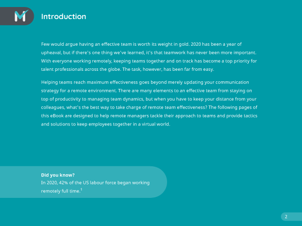
Designed a series of E-books as essential marketing assets for McQuaig's webinars. These E-books play a crucial role in enhancing brand promotion post-webinar, engaging attendees, and promoting the company's products. Used Adobe Illustrator and InDesign to craft each E-book, created illustrations for each cover based on the subject matter, ensuring they align with the McQuaig brand. The E-books serve as effective marketing tools, upholding the brand's identity while delivering valuable content to their audience. +
McQuaig's Documentations
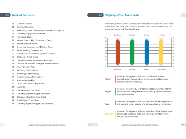
Crafted versatile templates that serve both internal and external purposes, utilizing Adobe Illustrator and InDesign. Designed with flexibility to meet specific requirements, such as different header styles. Technical manuals adopt a more simplified and professional appearance with smaller headers, while more generic or informational documentation features larger ones integrating illustrations and charts as needed. These templates now stand as adaptable assets, aligning with McQuaig's brand guidelines and intended for use by employees, partners, and clients. +
W*kattz's Sales Folder
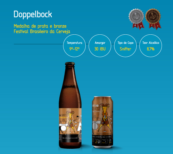
Developed a versatile sales folder for W*kattz Brewery's sales team. The folder, available in both digital and print formats, aims to assist sales representatives in presenting key information about the brewery's beers to potential clients.Designed with a clean and strong aesthetic, incorporating the brand's distinctive blue color, the folder offers a brief history of each beer and outlines their styles, sizes, and awards. The printed version includes QR codes for easy online access to detailed beer information. This sales folder serves as an effective tool for showcasing the brewery's story and the quality of W*kattz beers. +
W*kattz's E-flyers
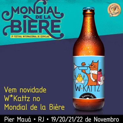
Consistently designed 2 to 3 e-flyers per week for W*kattz Brewery, for event announcements, new releases, or other various advertisements. The e-flyers were crafted to effectively communicate event details or product launches, while always maintaining the distinctive W*kattz brand identity.The focus was to preserve the integrity of the brand's cat illustrations, an essential element created by a talented Brazilian artist. The e-flyers played a crucial role in engaging the audience, keeping them informed about events and releases, and reinforcing the unique visual identity of the brewery. +
W*kattz's Mockups
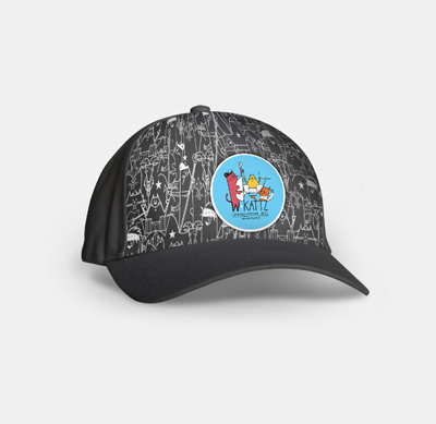
Designed mockups for W*kattz Brewery, focusing on labels, totems, coasters, and packaging. These mockups served a dual purpose: providing professional presentations for potential partners and creating engaging content for social media posts. +
Hija de Punta's Banner
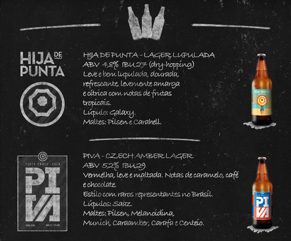
Designed a vintage-style banner for Hija de Punta Brewery stand, resembling a chalkboard. Created using Photoshop, the banner showcased a brief history and essential product information of each beer. +
Hija de Punta's Brochure
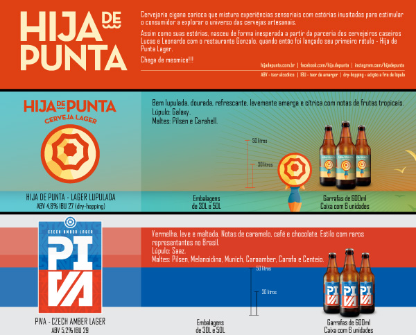
Created a sales brochure for Hija de Punta Brewery's sales team, presenting four distinct beers with unique labels. The objective was to harmoniously integrate these diverse labels while preserving their individual identity elements. The resulting brochure effectively showcased the brewery's product range with a cohesive and engaging design. +
Marmota's Sales Folder
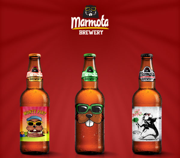
Designed a three-page sales folder for Marmota Brewery. The folder presents a brief overview of each beer's style, size, and notable awards. A straightforward yet impactful tool for showcasing Marmota Brewery's products. +
